Friday 28 January 2011

Cover analysis on 'Sight & Sound' magazine


As part of the marketing process, it is vital that a film gets enough media promotion in order to be successful and gain a larger span of audience. One magazine cover in which i looked at was a more independent one is 'sight and sound' as oppose to a more profound magazine such as 'empire' as my own horror teaser trailer promotes an independent horror which fits perfectly with this specific magazine due to it being more money efficient.

When first glimpsing at the 'sight and sound' magazine front cover, it is the image which is the prime stand out to viewers due to it taking up a quarter of the page and being such a strong image. Its colour is in black and white grayish tones, likewise to the colour scheme of the background. This may suggest that it is a black and white film or may just be an element of sophistication. Those who enjoy more independent films appreciate these use of subtle tones as they are not there to purchase the magazine because of the elaborated graphics and big bright colourful images but instead, this overview reflects the overall tone of the film, co-linking with its genre.

Focusing on the image, it is of a Japanese man looking as though he may be in the age region between 50 and 60. His age may suggest the films aimed to a more older audience as they can relate to the assumption that he is the protagonist. The presentation of the man is the stereotypical cliche image of the authorial character; wearing a near suit, holding a cigarette while also wearing dark shades. This denotes a sense of mystery as we are unaware of this mans profile and his role, which is a pull factor into wanting to read the full article. As his head is slightly raised as well as having straight lips gives him a confidence and shows he is a serious character.

The title is another significant feature which stands out as it is in a large, capitalised, bold red font. This name 'Kurosawa' may be familiar to a Japanese audience or Japanese film lovers who know he is regarded one of the most important influential film makers in the history of cinema. To others, if this name is un-recognisable to them, they may want to read the article to discover the meaning of this word and its relation to the film. From the text above, there instant assumption is that the name is of the 'Japanese cinemas last Emperor'.

This film appears to be a must see due to the other films the magazine focuses on in a lower key white font, listed under the red yet the smaller capitalised title 'plus'. There is little text on the overall cover, only listing the articles films which makes viewers eager into wanting to read up on what they are all about, as this information is hidden from the front cover. The text 'every new filmed reviewed' gives an insight as to what the magazine contains and although in the insignificant white font, it is in a red circle, appealing to lovers of the magazine who want to read and view the most recent, independent films released.

The magazines month release, 'July', is in the repetitive font colour of red so viewers are aware it is the most recent published copy. The price underneath however, is the most un-noticeable text as it is in the smallest font which may have been deliberate due to its relatively expensive magazine price £3.95. This cost appeals to more middle class readers as it is an affordable price for them to buy. The high price may also be an indication that the text inside is long and wordy, which is deliberately done for the stereotypical purpose that more wealthy viewers will want to read the text.

Monday 24 January 2011

Teaser trailer music


When editing a first outline for my teaser trailer, I wanted to find fitting music which contributed to the element of horror as well as being relative. After looking at different soundtracks across youtube I found a colaboration of both music and sounds which are unease to hear and I felt it fitted perfectly with the visuals.

Friday 7 January 2011

Analysis of 'The Grudge 2' film poster


When viewing a variety of different film posters, I choose to analyse 'The Grudge 2 as it automatically establishes the genre, what the poster suggests might happen in the film and the features which suggest what might happen. As a genre is a vague term with no fixed boundaries, it is important to construct a film poster which categorizes the type of film effectively. Janet Staiger argues that 'Hollywood films are not pure genres, because most Hollywood movies blend the love-oriented plot of the romance genre with other genres'. This was a factor which led me to create an independent film as oppose to a universal Hollywood hit as the horror branches out into sub-genres.

When viewing the poster it is the image which stands out above the other features as it is a re memorable one due to it being such a strong uncomfortable image. As the skin of what we know as the grudge from the first film as an established audience or having the automatic assumption is extremely pale, denotes the idea of death or the grudge being a ghostly presence. This idea if more horrific from the fear of the dead coming back to life. In my film poster I also to base the central image around the antagonist who has an extremely white washed complexion but as oppose to the grudge, to denote how Fearane is an outsider and not fitted into the conventions of society. Another aspect of the image which makes it successful is of the stark dark eyes being bloodshot around the outside. This may be deliberate to suggest the grudge is watching some ones every move and dares not to even blink. Fearane's eyes in my poster also holds significance as to make a horror poster successful, the fearful element can be expressed through the expression and appearance of the eyes. They are white washed and deeply horrifying to denote that this is the antagonist and he is the centre of fear through out the film. The final aspect which makes the poster successful is of the black hair is scattered around the characters face looking thin wired and almost as if the grudge is trapped. This may be the effect in which the grudge inflicts on its victims and we as viewers sense that feeling of being trapped. Similarly, Fearane has intense hair which looks unkept and contributes to the idea he is a 'crazy man'. I feel it is important to concentrate on all physical attributes which can be converted to add to the capacity of horror.

At the bottom of the poster under the central image, is another image in which looks as though it may be the films location. The building seems to be a haunted house which is a convention in many horror films due to the haunting feeling it gives off and the idea of the dead coming alive within.The dark tones the entire poster displays is yet a further element to the spooky feeling we sense will be widely present in the film. Around the haunted house is a misty air next to leafless branches which denote the film may be set around autumn/winter which are both perfect seasons to film horror in as the nights are darker and the air is foggier. A film focusing on the plot during night time is more horrifying, as it is more unease leading to viewers having the assumption that characters are not safe.

Thursday 6 January 2011

Preparation of shot


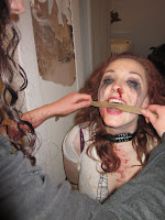
In order to successfully denote the idea that the character of Charlie is tied up and trapped in an abandoned room, I tied her hands and feet tightly to a chair so her body is unable to move, setting the reality of her situation. I also put a bike lock around her neck which looks to the audience to be a lock which isn't able to be taken off unless the correct code is typed into it. To further show her inability to escape, I put a strong tape around her mouth to give the effect that she cannot call out for help and is enclosed in the room in every single way. This strong sense of capture creates pathos, which we as viewers feel.     

For her overall presentation as a character, I aimed to make her visually appear as though she has been tortured and through a lot of harm.

Wednesday 5 January 2011

Stage three in making the character of Fearane

After working on Fearane's teeth and eyes, I then purchased an extremely pale foundation to achieve the white washed complexion I was aiming for. This took time to cover the entire face so the outlook was believable and realistic. When choosing this colour originally, I felt that it denoted a deadly ghostly look, which is common throughout horror that led me to my decision.

Stage two in making the character of Fearane

The second stage in making the character of Fearane was to white wash his eyes as I feel the eyes of the villain in horror is what makes the audience unease as there is a sense of mystery which we cannot read from them due to the look and appearance of the eyes. In order to achieve this portrayal, I bought a pair of contacts which successful did this as they appear as though they are the colour of the villains eyes. These give the feeling that the villain is watching viewers, an inescapable fear that his eyes are directed towards us.

Stage one in making the character of Fearane


In order to successfully make my villains teeth look unkept and dirty, i decided to mix coco power with hot water together for a dark brown mixture. I then applied this with a cotton bud around the villains teeth and smudged it in for it to look realistically horrific and gruesome. This was the first stage in making the finished character of Fearane.

Shot changes made during the process of filming

Once starting to film, I decided to change some of the shots I originally planned to use as I felt they were more associated in a horror teaser trailer. One of which I changed was a point of view shot of the villian chasing after Emily, a caught victim down a street. When filming, this didnt seem right as I felt it would be more horrifying for the victim to not escape so far but instead, with a struggle pulling themself away as oppose to running easily down the street even through severe cases of torture. This would create a more sympathetic connection with viewers as we empathise with their difficulty getting away. Not only this, but this change in shot is more of a tease to viewers as more questions are raised as to why the character is moving herself along the concrete.