Releasing a teaser trailer in the marketing process teasers the public through displaying a 'sneak preview' as to what the content on the film may be about. Viewers then become curious as they are eager in watching the entire film rather than left viewing the shots as a mystery.
The first shot which appears on screen is a close-up on the villains eyes which cause an uncomfortable feeling immediately due to the abnormality of them being white washed on an extremely pale complexion. This 'look' is conventional on many horror villains, one being the grudge who shares similarities. The eyes appear as if they are watching viewers, making them feel as if they are part of the unknown horror. The following shot from the eyes is a rather grotesque close-up on the villains mouth frothing, with an evil smile, commonly done by villains such as the joker from 'The Dark Knight'. Viewers sense this villain is confidently cunning with a destructive plan in store. The titles 'His mind is their prison' which appear over both shots relate to this idea, and clue viewers into the assumption of there being a capture by him, imprisoning his victims. As this plot idea given seems an emotionally disturbing storyline appeals more so to my direct audience group who are educated and willing to observe the twists that occur against their expectations. Others of both sexes and all ages who are attracted to this disturbance are also appealed to watching the movie on its release.
The shot of the villains feet, covered in both dirt and blood walking slowly towards the camera, further makes viewers feel part of the horror as if he is coming to get them. The technique entices viewers to the action taking place as they are excited from the thrill of being afraid.
Just as the feet are up to the point of the camera, there is a sudden shot change onto the victim Emily's back. Through the use of editing, we are then exposed to her crawling along the ground in the dark which raises questions; who is she? why is she pulling herself across the concrete?
After the slower build-up, the pace fastens slightly to a series of repeated shots on the villains eyes to a variety of sneak preview shots in between. The series of shots are visually memorable due to them being such a strong image. Viewers gather that the eyes moving edge to edge co-link with the plot and suggests that he may be searching for specific targets or raise the idea that he is looking for you! In many horror teaser trailers, a repeated image is a deliberate form used in order to make the film more recognisable to viewers when seeing the next stage of marketing.
The shots displayed in between the series of the villains eyes are conventional to the genre. Several are of one of the victims named Charlie, whom is tied up to a chair in an un-kept room; shouting for help behind her taped mouth while appearing afraid. Although knowing nothing about the character, viewers sense she plays the damsel in distress in which we feel sympathetic towards her. The feel of different emotions in which viewers have during the teaser create an understanding of the film and persuades them to discover more about the situation through watching the entire film. Like Emily, the editing technique used on Charlie whereby the shaking of her head brings the shot from a medium to a close-up allows viewers to see a preview of the state she is in; smudged make-up, blood smeared on her face along with understanding of her full capture with her mouth and neck ties up along with other parts of her body. Viewers are further able to get a sense of the situation she may be in through the point of view shot of the villain coming towards her whilst she is screaming, yet the sudden shot change teasers viewers as they do not find out what next happens. the final shot we see of the victim is of her behind a glass door silently screaming with blood smeared down the front of it. The follow up of shots on her keep the outcome a mystery as viewers are unaware of any relation to this girl.
Between the repeated shots on the villains eyes is, one shot includes a paralysed hand in which is holding a rosary with blood and scratches covered on the skin. The shot itself is ambiguous as viewers are un-clued to who's it is, or why the lower arm and hand is in the state it is in. Viewers come up with various answers to who the hand belongs to; the villain, the victims, or hidden characters. the element of tease encourages viewers to watch the film upon its release to discover the hidden facts.
The final shot exposed to viewers is a preview of the villains entire face which is visually horrifying. The way in which it moves forward extremely fast and then out of the camera view is unease, and yet another aspect making viewers feel as though the villain is coming at them. The second in which the villains face is viewable triggers a fear to what is next to come however we are teased by the sudden exit.
Not only do the shots abide to he rules of horror and build-up to tease but the background music in which follows each shot is horrifying to listen to. The collaboration of different sounds work well together in sync with the shots displayed. Examples include: the heavy breathing over the footsteps displayed, the screaming following on from the character screaming as well as the the words 'Halloween horror' said just being the 'This Halloween' title is displayed at the end. The deep red colour of the title as well as the final title 'Fearane' applies to the genre and a associated colours to horror; denoting blood, death and gore.
As 'Fearane' is an independent film, I felt that 'Sight & Sound' magazine was the overall most suitable magazine to use as the final stage of the marketing process. My target audience being typical readers of the magazine would therefore appreciate the artistic value of the film and its plot dealing with a realistic situation in which both themselves and younger generations face in the world today.
When creating the poster, I wanted to put special focus onto the central image which is commonly done throughout every issue of the 'Sight and Sound' magazine. As it is placed coming from the bottom of the cover is also typically done on this specific magazine, an example being on July 09's cover featuring 'Inglorious Bastard'. The image is of the two characters Charlie and Emily who play the role of antagonist Fearane's victims. I chose this particular image for variation, due to the film poster focusing more on the character of Fearane and his image. As they are in costume provides an insight to the audience as to what they look like yet their blank expressions do not clue viewers into the personality's they play. To those who previously viewed the teaser trailer would recognise different aspects on the image. These include the rosary in which one shot displays a paralysed hand clenching onto the item and another of Charlie's overview; a series of shots displaying her entrapped and crying out for help behind the tape covering her mouth. As both characters are covered in blood and have smudged make-up on the poster denote they have been crying and suffering physical pain which are factors present in the film. Although not recognising their persons, viewers sense their roles being ill-treated. Throughout horror, the use of blood and unkept appearances is common which is why i put emphasis on these aspects which we as as educated audience can relate to.
The background in which the characters are appearing out of is black, a colour which denotes darkness and the night. This exhibits the overall tone of the film; viewers get a feel of the horror within without having yet watched it. I deliberately chose to use the tones of black and red to relate to the genre and successfully make it appear horrifying to serve the viewers expectations.
I chose to place the title of 'Fearane' and cover line 'interview with grace thurlow and philippa davis' and ':number one halloween independent film' at the bottom so the cover doesn't appear as if it were a film poster. As they are in a red font colour follows the colour scheme throughout and denotes blood, danger and death. I chose to feature the two protagonists having being interviewed as target readers of the magazine whom are also my target audience enjoy long ready articles to find out more on up-coming and recently released films. As the text ':number one halloween independent film' is on the cover promotes the film and lures viewers into seeing this must-see film. The more cover lines on 'Fearane' make a stronger focus on this film as oppose to the over plus topics listed.
The 'plus' text is in a bold red font, not only to follow the consistent colour scheme but for the attention of the readers to be able to see what else the magazine consists of so they purchase the issue. However, these cover lines in which the magazine also features are in a white font but for deliberate effect as it separates these various topics from the 'Fearane' horror film. The topics focus on different aspects of film in the media; from an review of a film to a report on set for variation. Not only this, but the text 'every new film reviewed' is in a circle underneath which emphasises the amount the magazine preserves.
When Starting on my teaser film poster, I viewed many others beforehand whereby I took influence from 'The Grudge 2' film poster as its connotations successfully fitted in with the genre of horror, appearing appealing to its viewers.
I feel the image on a film poster is what immediately grabs the viewers attention as such an image engraves into their minds and is unforgettable. It is what viewers remember when seeing the next stage of marketing which is generally a teaser trailer. My central image of Fearane is dark and haunting, due to his head appearing out of the darkness. His intense facial features is what largely contributes to the horrific outview of the poster. Although his hair is unclear to see due to it blending into the background, as it half covers the villains eyes which are downwards looking up appears as though he is watching passers. The unusual colour of them being white washed is yet another element which successfully makes the eyes look horrifying, as its abnormality is unease and uncomfortable to view. Another facial feature that denotes the idea of horror is of the presentation of Fearane's mouth. His teeth which viewers can vaguely see appear dirty, reflecting the unkept state of the character in the film. As the appearance of his mouth is red with a trail of blood down his chin is a convention typical throughout horror. The colour red and blood denotes the idea of danger and death which are elements present in the film of 'Fearnane'.
Above the central image is a background image, contrasting to the continuous darkness spreading across the poster. The grey musty colours are of the ruined ceiling which is the prime location of the abandoned room in which the victims of Charlie and Emily are enclosed in. Fearane's left hand holding the ceiling in the background of the poster symbolises that the location is a place he is authorial and in control of and that his presentation reflects the place in which he inhabits. As an educated audience, we are aware that the antagonist in horror and the location combined together is to an extent what can make the film more disturbing as it is the mise en scene and human villain which makes the horror more realistic and I originally aimed to make this come across on my teaser poster.
Both the title 'Fearane' and tag line 'His mind is their prison' are both in the colour deep red which is a convention I follow throughout the different aspects displayed on the poster. All denote the same meaning which strongly indicates to viewers the type of horror 'Fearane' is all about.
The age rating '18' is a further clue to the extent of horror in 'Fearane' as this age rating vindicates the amount of gore and violence present in a film. Nowadays, people are more interested in horror films with this age rating as they want to be scared as the prospect of being afraid is exciting. My horror movie is based around realistic settings and situations which can happen to anybody and this is what lovers of horror are looking for.
On looking at high revenue films and when in year they were released to their target audience, I assessed my own product and at which time its distribution should take place. Placed in the horror genre, I felt that Halloween, the 31st October was a time of year in which people seek to watch a horror movie therefore resulting in a wider span of audience wanting to view my product. An example of a movie having a sub-genre of horror is Saw 3D released in 2010 which in its open week-end alone in the USA made a total of $24,230,123 and shown in 2808 screens. Although an internationally popular film, I feel that the success of my independent horror 'Fearane' would be largely great as the time of year draws in my target audience as oppose to the film having been released during the summer season.
Icon Film Distribution is part of the group which includes Icon Film productions. This independent film production company was founded in 1989 by Mel Gibson who is an actor and director to finance his production Hamlet. I chose this distributor as it has become a leading distributor of independent films, especially in Australia and New Zealand so is well known world wide. Examples of films it has distributed, are Bend it Like Beckham, Slumdog Millionaire and Knowing.
As an independent film maker, the marketing process is essential in promoting your must-see movie. It is vital to release a poster, teaser trailer and magazine cover to advertise and lure in your target audience so when the film comes out, they are eager to see it.
The first part of this process is to advertise the film through a teaser poster, which usually displays one central character, object or text that holds a high significance within the film. It establishes the genre through its presentation, and through not displaying enough shots from the film, excites viewers as there is a thrill of suspense. Whether it be an image, object or title that is displayed locks into viewers minds and is a memorable visual that we recognise in the next stage of marketing.
This stage is the release of a teaser trailer. Just as a shot is about to reach its peak, the turn away from that shot onto the next is a technique used to invite viewers to watch the entire movie to find out what they were previously hidden from. The teaser allows viewers to have a sneak preview into aspects of the film but doesn't reveal too much information, only providing a taster as to what the film is all about.
The final part of the marketing process is a magazine cover which is generally printed a week before the release of the film. This stage allows viewers to find out more information about aspects in the making and the actual film itself with one or more images displayed, providing an insight as to who the protagonists are.
When developing my own product and its ancillary texts for marketing use, I considered how each would appeal to my initial target audience. As an off-beat horror, it acquires the audiences full understanding in which my direct audience group; that being readers of Sight and Sound magazine are a suitable target. However, to stretch beyond this target is where the teaser trailer and poster come in. The protagonists being in their teen years allow passers between the ages of 16-24 to become attracted to these promotional products as they can relate to the characters. Although both females, the male antagonist and gory sub-genre appeal to males as well which results in a wider span of audience.
Amongst the many film articles that 'Sight and Sound' magazine includes, I chose to analyse 'White Material' as it is a perfect representation as to the type of film the international film magazine reviews, giving a synopsis and critical response.
When first viewing the two page spread, it is the proportion of text which stands out against the other features, covering about 65% of the space. The article by Claire Denis talks about both the pros and cons of the film. Although complementing the physical and abstract melodrama, commenting of the master of rhythm within as well as the fusions of image and sound, she also makes the point that the obscure pieces of the plot make more sense 2nd and 3rd time round of being watched, possibly because the images create the narrative rather than vice versa. The perfect balance of critical and complementary points make the article an enjoyable read, appealing to a more older, middle class reader who appreciates the long wordy review. To promote the film in order to successfully achieve having a wider span on viewers, there are constant references to similarities between this and big budget movies. The mention of well known actor Johnny Depp further shows the standard of 'White Material'.
Other text on the two page spread which is deliberately made to stand out against the other text is of the bold slightly larger font. One- 'The symbolic centre of this maelstrom...who seems to be a dead man from moment we glimpse him' relates to the image of the close up of the man and explains the idea of him looking 'dead' just as the fear of the man we sense from the image displays. The mans facial expression denotes the problems which occur in the film, and we as viewers gather him being a victim.
As the image on the close up of the man is on the left side of the page, so is another image of two other protagonists in which text surrounds both. Just as there is a divide of race in the film, both images denote this message. The use of colours in both images are contrasting. The man appears to be in a room, looking as though he is too afraid to leave. The interior from what is visible is dark and glum with a bleak atmosphere. The second image on the other hand is a shot filmed with high key lighting during daytime, with the characters surrounded by greenery. Although the atmosphere is not uncomfortable just as the first image is, the medium shot of the characters engaging denotes concern, evidently from their facial expressions.
As part of the marketing process, it is vital that a film gets enough media promotion in order to be successful and gain a larger span of audience. One magazine cover in which i looked at was a more independent one is 'sight and sound' as oppose to a more profound magazine such as 'empire' as my own horror teaser trailer promotes an independent horror which fits perfectly with this specific magazine due to it being more money efficient.
When first glimpsing at the 'sight and sound' magazine front cover, it is the image which is the prime stand out to viewers due to it taking up a quarter of the page and being such a strong image. Its colour is in black and white grayish tones, likewise to the colour scheme of the background. This may suggest that it is a black and white film or may just be an element of sophistication. Those who enjoy more independent films appreciate these use of subtle tones as they are not there to purchase the magazine because of the elaborated graphics and big bright colourful images but instead, this overview reflects the overall tone of the film, co-linking with its genre.
Focusing on the image, it is of a Japanese man looking as though he may be in the age region between 50 and 60. His age may suggest the films aimed to a more older audience as they can relate to the assumption that he is the protagonist. The presentation of the man is the stereotypical cliche image of the authorial character; wearing a near suit, holding a cigarette while also wearing dark shades. This denotes a sense of mystery as we are unaware of this mans profile and his role, which is a pull factor into wanting to read the full article. As his head is slightly raised as well as having straight lips gives him a confidence and shows he is a serious character.
The title is another significant feature which stands out as it is in a large, capitalised, bold red font. This name 'Kurosawa' may be familiar to a Japanese audience or Japanese film lovers who know he is regarded one of the most important influential film makers in the history of cinema. To others, if this name is un-recognisable to them, they may want to read the article to discover the meaning of this word and its relation to the film. From the text above, there instant assumption is that the name is of the 'Japanese cinemas last Emperor'.
This film appears to be a must see due to the other films the magazine focuses on in a lower key white font, listed under the red yet the smaller capitalised title 'plus'. There is little text on the overall cover, only listing the articles films which makes viewers eager into wanting to read up on what they are all about, as this information is hidden from the front cover. The text 'every new filmed reviewed' gives an insight as to what the magazine contains and although in the insignificant white font, it is in a red circle, appealing to lovers of the magazine who want to read and view the most recent, independent films released.
The magazines month release, 'July', is in the repetitive font colour of red so viewers are aware it is the most recent published copy. The price underneath however, is the most un-noticeable text as it is in the smallest font which may have been deliberate due to its relatively expensive magazine price £3.95. This cost appeals to more middle class readers as it is an affordable price for them to buy. The high price may also be an indication that the text inside is long and wordy, which is deliberately done for the stereotypical purpose that more wealthy viewers will want to read the text.
When editing a first outline for my teaser trailer, I wanted to find fitting music which contributed to the element of horror as well as being relative. After looking at different soundtracks across youtube I found a colaboration of both music and sounds which are unease to hear and I felt it fitted perfectly with the visuals.
When viewing a variety of different film posters, I choose to analyse 'The Grudge 2 as it automatically establishes the genre, what the poster suggests might happen in the film and the features which suggest what might happen. As a genre is a vague term with no fixed boundaries, it is important to construct a film poster which categorizes the type of film effectively. Janet Staiger argues that 'Hollywood films are not pure genres, because most Hollywood movies blend the love-oriented plot of the romance genre with other genres'. This was a factor which led me to create an independent film as oppose to a universal Hollywood hit as the horror branches out into sub-genres.
When viewing the poster it is the image which stands out above the other features as it is a re memorable one due to it being such a strong uncomfortable image. As the skin of what we know as the grudge from the first film as an established audience or having the automatic assumption is extremely pale, denotes the idea of death or the grudge being a ghostly presence. This idea if more horrific from the fear of the dead coming back to life. In my film poster I also to base the central image around the antagonist who has an extremely white washed complexion but as oppose to the grudge, to denote how Fearane is an outsider and not fitted into the conventions of society. Another aspect of the image which makes it successful is of the stark dark eyes being bloodshot around the outside. This may be deliberate to suggest the grudge is watching some ones every move and dares not to even blink. Fearane's eyes in my poster also holds significance as to make a horror poster successful, the fearful element can be expressed through the expression and appearance of the eyes. They are white washed and deeply horrifying to denote that this is the antagonist and he is the centre of fear through out the film. The final aspect which makes the poster successful is of the black hair is scattered around the characters face looking thin wired and almost as if the grudge is trapped. This may be the effect in which the grudge inflicts on its victims and we as viewers sense that feeling of being trapped. Similarly, Fearane has intense hair which looks unkept and contributes to the idea he is a 'crazy man'. I feel it is important to concentrate on all physical attributes which can be converted to add to the capacity of horror.
At the bottom of the poster under the central image, is another image in which looks as though it may be the films location. The building seems to be a haunted house which is a convention in many horror films due to the haunting feeling it gives off and the idea of the dead coming alive within.The dark tones the entire poster displays is yet a further element to the spooky feeling we sense will be widely present in the film. Around the haunted house is a misty air next to leafless branches which denote the film may be set around autumn/winter which are both perfect seasons to film horror in as the nights are darker and the air is foggier. A film focusing on the plot during night time is more horrifying, as it is more unease leading to viewers having the assumption that characters are not safe.
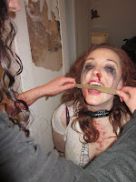
In order to successfully denote the idea that the character of Charlie is tied up and trapped in an abandoned room, I tied her hands and feet tightly to a chair so her body is unable to move, setting the reality of her situation. I also put a bike lock around her neck which looks to the audience to be a lock which isn't able to be taken off unless the correct code is typed into it. To further show her inability to escape, I put a strong tape around her mouth to give the effect that she cannot call out for help and is enclosed in the room in every single way. This strong sense of capture creates pathos, which we as viewers feel.
For her overall presentation as a character, I aimed to make her visually appear as though she has been tortured and through a lot of harm.
After working on Fearane's teeth and eyes, I then purchased an extremely pale foundation to achieve the white washed complexion I was aiming for. This took time to cover the entire face so the outlook was believable and realistic. When choosing this colour originally, I felt that it denoted a deadly ghostly look, which is common throughout horror that led me to my decision.
The second stage in making the character of Fearane was to white wash his eyes as I feel the eyes of the villain in horror is what makes the audience unease as there is a sense of mystery which we cannot read from them due to the look and appearance of the eyes. In order to achieve this portrayal, I bought a pair of contacts which successful did this as they appear as though they are the colour of the villains eyes. These give the feeling that the villain is watching viewers, an inescapable fear that his eyes are directed towards us.
In order to successfully make my villains teeth look unkept and dirty, i decided to mix coco power with hot water together for a dark brown mixture. I then applied this with a cotton bud around the villains teeth and smudged it in for it to look realistically horrific and gruesome. This was the first stage in making the finished character of Fearane.
Once starting to film, I decided to change some of the shots I originally planned to use as I felt they were more associated in a horror teaser trailer. One of which I changed was a point of view shot of the villian chasing after Emily, a caught victim down a street. When filming, this didnt seem right as I felt it would be more horrifying for the victim to not escape so far but instead, with a struggle pulling themself away as oppose to running easily down the street even through severe cases of torture. This would create a more sympathetic connection with viewers as we empathise with their difficulty getting away. Not only this, but this change in shot is more of a tease to viewers as more questions are raised as to why the character is moving herself along the concrete.


 After working on Fearane's teeth and eyes, I then purchased an extremely pale foundation to achieve the white washed complexion I was aiming for. This took time to cover the entire face so the outlook was believable and realistic. When choosing this colour originally, I felt that it denoted a deadly ghostly look, which is common throughout horror that led me to my decision.
 The second stage in making the character of Fearane was to white wash his eyes as I feel the eyes of the villain in horror is what makes the audience unease as there is a sense of mystery which we cannot read from them due to the look and appearance of the eyes. In order to achieve this portrayal, I bought a pair of contacts which successful did this as they appear as though they are the colour of the villains eyes. These give the feeling that the villain is watching viewers, an inescapable fear that his eyes are directed towards us.

